The Prince has published on line a gallery of his pictures. The gallery begins here.
A serious publication deserves serious evaluation - he's no less entitled to that than anybody else who picks up a brush and allows you to see their work. Watercolour is a defiant medium; it's just you, a few colours, paper, brush, and a pot of water. That's all you need to record your world. It's much less complicated than most other media but technically its a testing one because you have to have it clear in your head what you want to do and then lay it down in relatively few strokes.
Watercolour doesn't give much in the way of second chances; too many revisions and it goes muddy. Spiritually it is closer to handwriting than painting; it's best if you get it right (write) first time because the corrections are difficult to disguise. Experimentation is best done on cheaper paper; the idea is to find out how to work the brush and paint without worrying about a picture, then, when you have sorted out the strokes, turn back to reality and try to get the picture space organized.
Watercolour is democratic; it costs relatively few pounds to get going with a decent block of paper, a couple of brushes and a limited pan of colours. The brushes are the most expensive items but cheap brushes will still get you started. You will be working with materials which any professional would be just as happy to use. The grandma taking a U3A class starts from the same place as an Academician.
It is therefore interesting that the Prince chooses not an expensive camera but something which links him to every school child and hobbyist in the country. Moreover, he chooses to pursue that common experience "Wow, I wonder if I could get that down on paper?". Most of us give up at that point and get out the camera.
The pictures have been grouped by theme and location. It is obvious where his heart is, but for evaluation the question is: has he caught the differing lights in the various countries? How you judge that might depend on how well you know the places. I think it is obvious from the selection that he is using watercolour as a private record, a way of fixing experience on paper but is not always sure which aspect of experience it would be best to anchor the picture in.
There are choices in any picture when you have only limited time and palette. A giant major oil painting allows you to try for several in the same picture, but with watercolour you have to make that decision at the beginning and stick to it. Do you want the structure of the rocks and buildings? Or are you more concerned to always be able to get back to the fleeting sense of light over a landscape? Or you might be more in love with the impossible colours and decide to focus all your attention on the them and their relationship to each other. This might yield an abstract image which structurally bears little resemblance to the thing you saw.
Painters such as Samuel Edward Kelly (below) managed to combine these competing aspects and yet keep the colours clean, but there is also a strand of English watercolours which simply gives up and lets it go all sepia. They often paint decrepit barns and cottages where you'd expect it to be dingy.
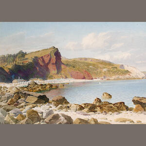 |
| Samuel Edward Kelly. Babbacombe. |
It is often said that Prince Charles dithers; his pictures express an uncertainty about which aspect he wants. Since photography has been invented, it isn't strictly necessary to paint a picture for that purpose now. If he picked two high-contrast shades, light and dark, concentrating only on pushing areas of the picture plane back, pulling others forward, he'd find the weight of the rocks compared to the lightness of the air would emerge. They don't have to be strictly real; they just have to work in relation to each other.
Alternatively, many of the pictures show he is struck with the unearthly intensity of colour but then steps back politely, as if he doesn't want to be caught over-reacting and feels unable to lay down the ultramarine in case someone accuses him of not getting it quite right. The online collection does not show it, but there are times when light around Sandringham is psychotic; the leggy pine tress turn brick-red with slashes of dark emerald needles, the sky turns cerulean blue and the sun blood-drops in to the Wash. Those are the evenings he should be out on Holkham beach saying this is my paintbox, my picture, and I'll damn well paint it whatever colour I see fit.
Overall - sound catalogue, keep going, get bolder. There's always some bugger telling you that you can't do it this way, or that you shouldn't try at all. Don't listen to the Telegraph.